
 |
| This magnificent machine is a 10-color capable flexographic printing press. That's Dustin, the operator of this press, on the far end. |
As you can see, this printing process is physical, not digital. I hope I've learned enough about the process to describe it accurately!
Our digital designs are converted to flexible (hence, flexographic) plates. In the case of our individual lollipop label designs, they repeated the design in four "lanes" to make optimal use of the 7-inch label stock. Creating these plates is a one-time expense, an investment in this process and in our future print runs, whose cost goes way down the second time around!
 |
| I'm holding the flexible plate for "tart pluot" flavor |

Here, the "root beer float" plate is wrapped around a roller (it has a more specific name that I don't remember). This is the layer of the design that uses charcoal ink, and it's picked up that ink from another roller. Speaking of ink...
Getting the colors perfect was one of the most important factors to me in choosing a new label process. I'm now working with talented craftsmen who mixed the ink to my specifications, and will do so every time. We start with a Pantone color that's close to the output we want, and judge and compare the samples coming off the line.
 |
| Just a few of the bottles of ink colors at Northwest Label |
 |
| Dustin adds a little more yellow ink to the blue. |
 |
| A Pantone color guide and various printed color samples for comparison. It took multiple adjustments to achieve the desired shade of pale turquoise. |
I took a few brief videos. This one shows the two steps in our printing process: printing the turquoise pattern, then the flavor name. Because the machine is 10-color capable, there are stations along the press where nothing is printed.
After a die cuts the desired shape for our label, the press peels up the unwanted "matrix" of unusable material and winds it up on a roll above the press. I think this looks super cool. Later, it's recycled.


Next, the big rolls are cut down into single rolls and re-wound on a cardboard core.
 |
| Rolling knives cut between the label lanes |
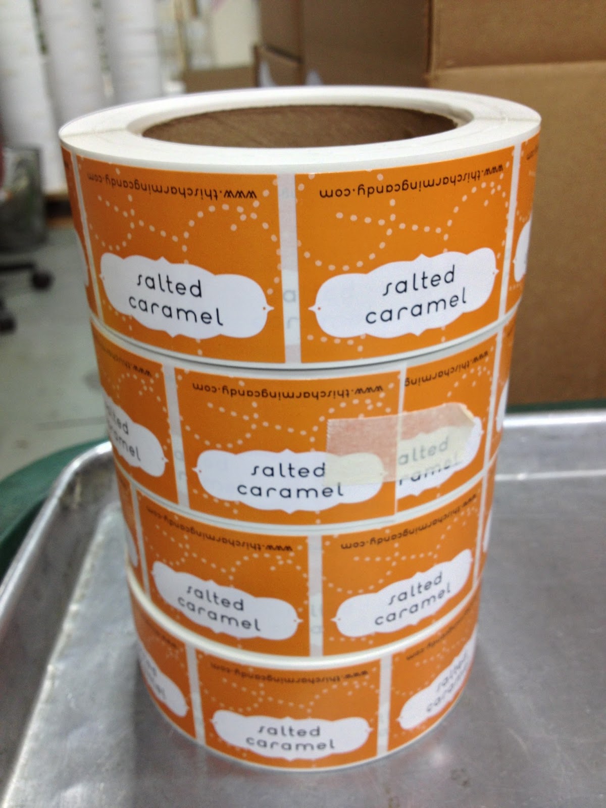 |
| a stack of finished Salted Caramel label rolls! |
Each of these rolls has 300-500 labels on it depending on what I ordered. I de-hoarded a cabinet to store label rolls in, and I'm beyond tickled at how neat and tidy they look - and how little space 12,000 labels occupy!
 |
| Orange, Yellow, Turquoise and Purple are our 2013 color families |
Eagle-eyed fans might notice that some of our existing colors, namely spring green, charcoal, and brown, are curiously absent from this photo. More on that in an upcoming post...
When I'm ready to put the labels onto the lollipop bags, I can now use my spiffy Dispensa-matic U-45 (what a fantastic name!).
Brand-new flavor Rosemary Lemonade was the first one I labeled when I got back with all my spiffy new rolls.
I'm extraordinarily pleased with Northwest Label. My rep there, Jeff, worked with me over many months as I explored my options, thought deeply about I wanted to do with our existing flavors, brought new flavors on board, and so on. I'm really happy to have a local partner for such a key part of our product packaging, and am proud to support other craftsmen. Onward!
No comments:
Post a Comment
Note: Only a member of this blog may post a comment.